Launching interactive context menus in nTop to improve user retention
UX | UI | desktop applications
Overview
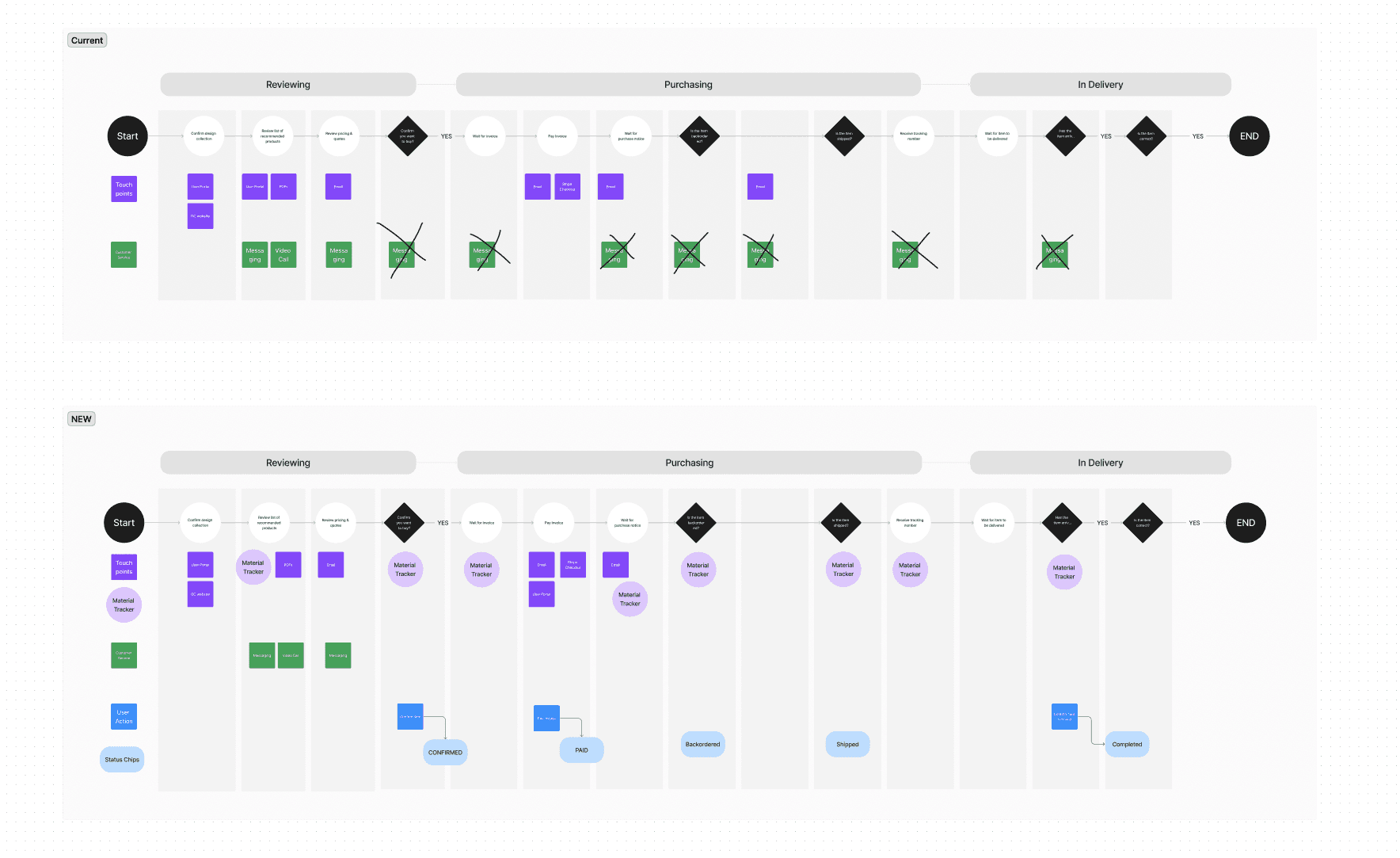
In the beginning, this project was not just about menus at all.
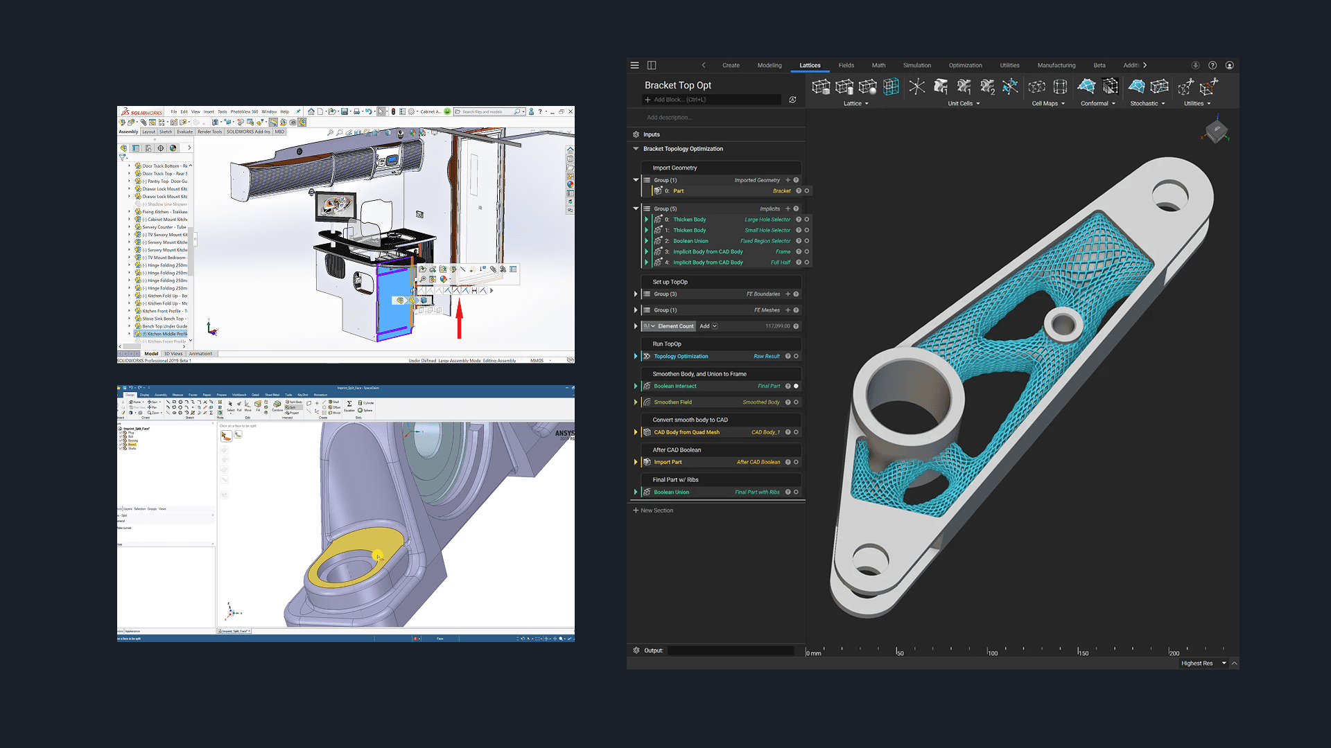
I was brought onto a new team to solve the problem: “How do we make the 3D viewport more useful and efficient for CAD engineers? How do we solve problems with selection?”
This involved a 1.5 month process of conducting customer interviews, reviewing product data on customer feedback and support tickets, doing competitive research, auditing features of the 3D viewport, and Concept Prototyping.
what i did
UX Research, Customer Interviews, UX Design, UI Design, Prototyping
collaborators
Product manager, Design manager, Engineering manager, Graphics engineer
The problem
Customers take an average of 3.5 months of training to realize the value of using nTop.
Mechanical engineers with traditional CAD background find nTop's visual programming experience difficult to learn. 80% of actions are performed in the 2D notebook UI vs in the 3D viewport. However... typical CAD software is a more balanced experience between 3D and 2D.
research
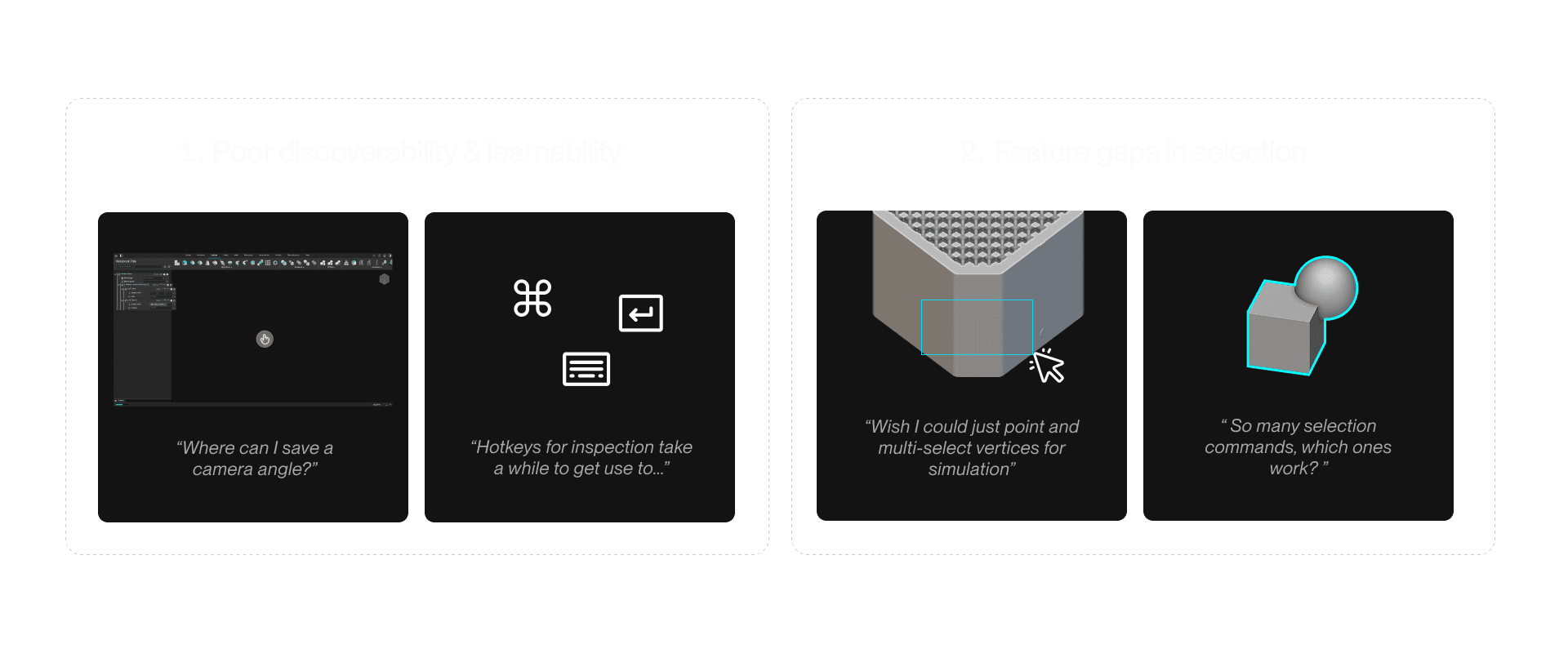
Interviewing customers, reviewing support tickets and product analytics revealed 2 major problems with the 3D viewport
workshop & ideation
After workshopping proto-user stories and hosting async-workshops for ideation, our findings point to one glaringly missing pattern - context menus
I created prototypes of the most interesting ideas and gathered feedback from internal application engineers and power users.

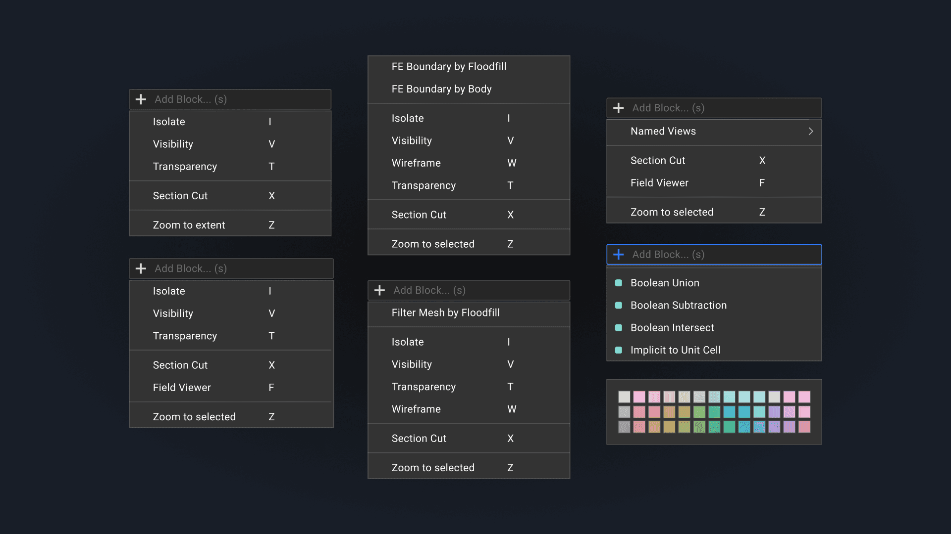
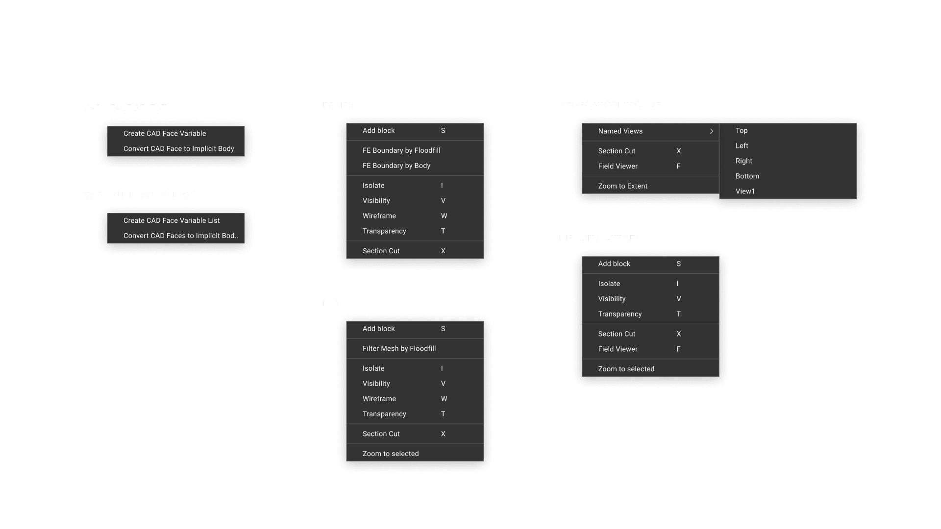
Information Hierarchy and UI
Grouped functionalities for information hierarchy and added 11 new functionalities for visibility and camera controls
Discussion with PM about user stories with viewport navigation led to shortlist of new menu options
These functionalities are either highly requested by users in the past or common in CAD programs.

Designing modular menus so that different commands can work on different objects and maintain consistency.
Introducing new UI patterns - context search and color selector - was met with technical challenges
As a stretch goal, there are 2 features that we saw high potential to make user’s everyday workflows faster. Feedback from 5 internal expert users were all strong advocates for these two features.
However, there were technical roadblocks to overcome.

Final Design & outcome
On the development side, this was the first project that consolidated use of a design system pattern between design systems team & application team
Thank you for reading!
For the full case study , feel free to reach out via email :)